
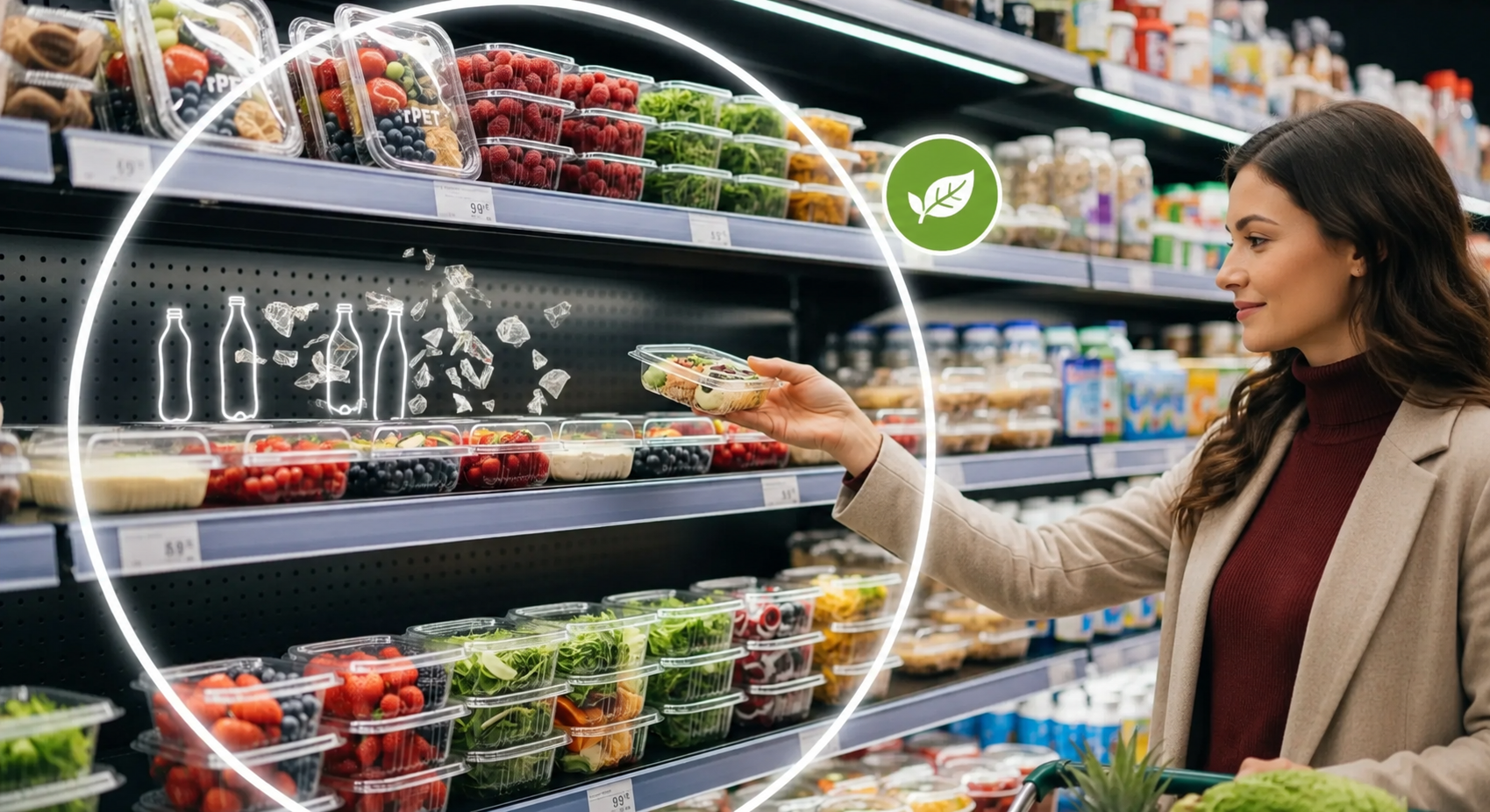
A shopper may notice the logo, colors, and product name first. But when the pack is clear, they also see the fruit itself. That combination can influence how fresh and well-presented the product appears at retail.
The harder part is making branding work without hiding the product, weakening the pack, or creating problems during handling. In fruit packaging, the material and the graphic design need to work together.
Why branding starts with product visibility
Fresh fruit is often judged before the package is opened. Clear packaging lets buyers inspect color, size, and overall condition without handling the fruit, which makes optical clarity an important part of shelf presentation.
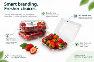
A large label placed over the main viewing area can work against that advantage. A better approach is to use a defined branding area while keeping the most visible part of the pack clear. This could mean positioning graphics on the lid, sidewall, sleeve, or designated label area while keeping the primary viewing zone open.
That requires material with reliable clarity and enough stiffness to maintain the intended pack shape during filling, stacking, transport, and display.
Where branding should go on a fruit pack
Branding does not have to cover the main viewing area. Depending on the pack format, brands can use lid labels, sidewall labels, sleeves, top-label zones or secondary packaging to carry brand and product information.
Position QR codes and barcodes where they stay easy to scan without interfering with the main product-viewing area. Space may also be needed for recycling information, country-of-origin details and other required product information.
For private-label programs, the pack shape itself can also contribute to brand recognition. Custom geometry, lid profiles and pack formats can create a distinctive shelf presence while keeping the fruit visible.
Why protection still matters after the branding is finished
A visually attractive pack has limited value if the fruit arrives damaged. This is particularly important for delicate produce such as berries, cherries, grapes, and other fruits that can be affected by compression or rough handling. Clamshell-style packs can help protect produce from physical contact and reduce the risk of bruising during distribution and retail handling.
Packaging design must also suit the product. Ventilation, pack geometry, closure strength, and the fit around the fruit all influence how the package performs through the supply chain.
For fruit packaging, branding should therefore be designed around the protection system, not added without considering it.
Why pack consistency matters for branding
A branded pack needs to look consistent across production runs. Uniform geometry, clear viewing areas, closure fit and overall finish help ensure that the same brand presentation is maintained from one pack to the next.
Material and forming consistency support that repeatability, but they should serve the branding and finished-pack requirements rather than become the focus of the article.
Why clarity and stiffness need to work together
Clarity attracts attention, but clarity alone is not enough.
A fruit tray or clamshell also needs sufficient stiffness to hold its shape during filling, stacking, shipping, and retail handling. At the same time, the branding treatment should remain readable without unnecessarily blocking product visibility.
For fruit packaging, the right balance can support three results at once:
- Clear product-viewing area
- Defined branding space
- Reliable pack structure
- Consistent shelf presentation
The goal is to give the brand enough space to communicate while keeping the fruit visible and the pack suitable for handling, stacking and display.
How packaging design supports shelf presentation
APET can support clear fruit packaging where product visibility, pack rigidity and thermoforming performance are important. However, select the material based on the finished pack design, branding method, fruit type and handling requirements.
Start the branding decision with how the pack needs to look and function on the shelf, then work backward to the appropriate material and format.
How AVI Global Plast supports reliable packaging performance
AVI Global Plast supplies PET-based sheet solutions for thermoformed fresh-produce packaging, supporting applications where pack appearance, structure and production requirements need to work together.
For branded fruit packs, material selection can be considered alongside the pack format, branding zones, product visibility and intended retail application. A strong package should attract attention without hiding the product or reducing protection. When material performance, branding, and package structure are considered together, fruit packaging can deliver more consistent results from the production line to the retail shelf.
Planning a new fruit packaging application? Contact AVI Global Plast to discuss APET sheet selection based on your package design, forming process, branding requirements, and performance needs.
FAQs
Where should a label be placed on fruit packaging?
Place branding where it remains visible without unnecessarily blocking the main viewing area. The lid, sidewall and designated label zones can offer useful options, depending on the pack format.
How much of a fruit pack should remain clear?
The main product-viewing area should generally remain clear enough for shoppers to inspect the fruit. The required clear area depends on the fruit, pack design and branding requirements.
Can fruit packaging be customized for private-label programs?
Yes. Depending on the packaging format, customization can include labels, sleeves, graphics, pack geometry and other branding elements.
Where should QR codes and barcodes be placed?
Position them where they remain accessible for scanning without interfering with the primary product-viewing area or other required packaging information.